
Do radar plots need to die?
Considering some critiques of the Radar Plot style from PyMC Labs

One of the big projects I am working on right now, and that has taken much of my time that I’d normally spend writing here is building out a website/tool that should become a helpful source of information for Adam and I, and also hopefully for the subscribers here. I am hopeful that this will roll out sometime this summer and I will have more information on that in the coming days/weeks.
This website, like the standard player team analytics will feature radar charts. They have become an industry norm after being popularized by Ted Knutson formerly of StatsBomb. They are pretty to look at, and they can (and I believe do) give you a good quick look at a player.
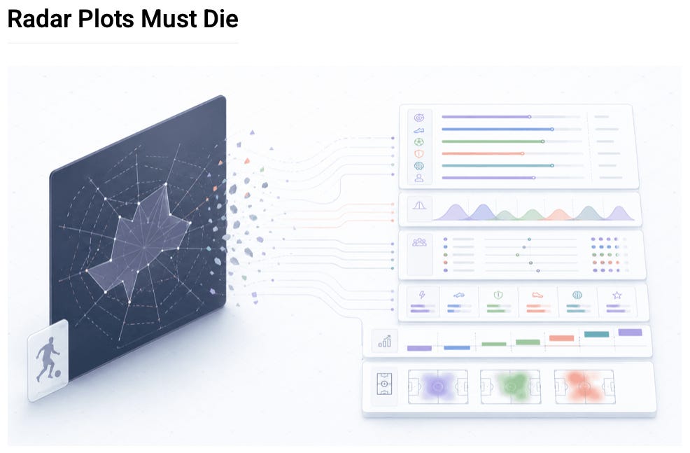
They aren’t perfect by any means, no graphic is and this was pointed out in a post from PyMC-Labs called “Radar Plots Must Die.”
I use radars, and I plan on continuing to use them going forward and this made me want to directly address a few of the things brought up and what I do to address them or correct some things aren’t quite right.
Let’s go through this now.
A radar plot takes a vector of percentiles and draws it as a closed polygon in two dimensions. The reader perceives the shape of the polygon; they see area, aspect ratio, pointiness, balance, lopsidedness. Yet, none of those perceptual features correspond to anything real about the player.
This might be a little ticky tacky but right off the bat, there is a generalization here that isn’t universally true and this goes to larger points down the road. It is written here that a radar is based off the percentile value, that is a way that you can present a radar but that is not how ALL radar charts are done.
Statsbomb sets the first ring at the 5th percentile value and the 95th percentile value and then has the chart be linear between those points. For reasons we will go over later, I have also adopted this approach.
The critique on how a reader perceives a graphic isn’t unique to a radar and that would be similar on most charts. It isn’t like bars correspond to anything real a player has done on a pitch than a polygon shape.
Let’s move on to the next critique, Order and adjacency are arbitrary. This is absolutely true and something that can be a problem. Let’s read what was written here in the post:
There is no intrinsic order among a given set of football metrics. xG, tackles, pass completion, aerials won are independent quantitative dimensions. The deeper problem is that a radar is an inherently spatial display, and spatial displays invite spatial inference. When two spokes are drawn next to each other, the brain reads them as neighbours, as if xG and pass completion belonged together because they are physically close on the page (they are even joined together by a line). But that proximity is an analyst's choice, not an inherent property of the data.
This is valid and the stats that you choose, and the order that you place them in matters. There isn’t an intrinsic order but there are stats that do work together and when you are doing a design you can make choices that help preset this information in a coherent fashion. xG and pass completion don’t necassariy belong next to each other but xG and shots, or xG and touches in the box? Those make sense to be near each other.
When I have designed the templates for the radars I use, I try to pick relevant stats to the position things so that they are by category and flow into each other in a way that would make sense.
The author here shows how changing the order can alter the way that you perceive the data.
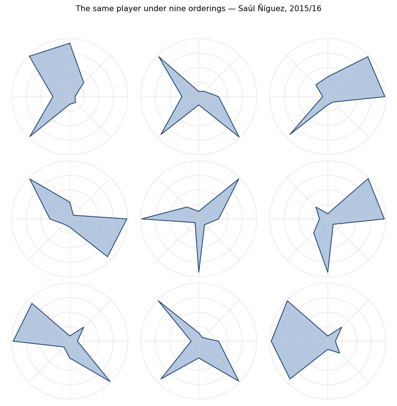
This is something that is possible and that is why picking the stats and the order that you place them in can’t be done without thought and care. This isn’t a unique issue to radar’s either though. If you did something similar with bar charts (which are viewed as superior here) the same issues can arise.
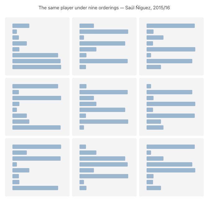
I mocked up something similar here with bar charts as what was done with the radars.
The same issue can become a problem if you aren’t careful with any visual that you go with. Axis ordering can be arbitrary as pointed out here, but it doesn’t have to do and for a well designed radar it isn’t.
Let’s go to the next issue, radial encoding exaggerates strengths and hides weaknesses.
This is a technically true issue but I am not sure that this is how people that have become familiar with radars as a visual perceive the charts. Here is the critique:
Ordering aside, the radar has a second problem. The radial axis encodes percentile linearly. For example, a p80 spoke is twice as long as a p40 spoke… Every term is a product of adjacent values. Each spoke is one side of two such triangles, one with each neighbour, so its visual weight is proportional to its own percentile times the sum of its neighbours’, not to its percentile alone (and those neighbours, again, are not necessarily related to it). A high spoke flanked by other high spokes is amplified; a low spoke flanked by other low spokes is suppressed beyond what its percentile alone would suggest. The polygon a reader perceives is not the percentile vector; it is a non-linear, ordering-coupled rendering of it.
I can only speak for myself, but I don’t think that I am mentally computing the area but rather viewing the distance from the center. I looked at the example provided in the article and I struggled to even comprehend where the distortion was supposed to be happening here. Maybe I have looked at too many radars and thus the issue is less of a problem for me than it could be with others but ultimately I think that this is overblown.
It's a bit like arguing bar charts are misleading because wider bars look more important than narrow bars of the same height. Technically true about area perception, but with careful design this shouldn’t be a problem.
The careful design and the thoughtful choice and order of stats is still key here. When you intentionally group stats by skill domain, shooting metrics next to each other, creative metrics next to each other, defensive metrics next to each other; the adjacency stops being arbitrary and starts being meaningful. With this, shapes and patterns can become quick to understand things about a player quickly as you recognize the shapes start to tell you important information about a player, if you get a visible "bulge" in the defensive region or a "dip" in the creative region, this shape corresponds to a real profile and skills of a player.
The last critique brought up is another one that is technically true and is valid but again I think asks a radar do something that it is not necessarily the best tool in the toolbox if that is what you are trying to accomplish.
The author makes the point that non-adjacent comparisons are tough:
Each spoke of a radar is its own axis, oriented at its own angle. To compare any two variables, the reader has to mentally rotate one onto the other before judging which value is larger; the further apart the two spokes sit, the larger that rotation and the costlier the comparison.
Yes, if your task is “compare this player’s xG percentile to their tackles percentile with precision,” a radar makes that harder than a bar chart. You’re comparing two spoke lengths at different angles against curved grid lines versus two bars on the same baseline. Humans are better at comparing lengths on a shared axis than lengths at different angles.
Practically, does this matter? When does a reader sit down with a player radar and think “I need to determine whether this player’s progressive carries percentile is higher or lower than their aerial win percentile, and by exactly how much”? Almost never. That’s a table task. If you need precise numerical comparisons between specific metrics, you should be looking at a table, not any visualization at all. Bar charts are also worse than tables for this task.
The actual task radars serve is rapid profile recognition. You glance at it and within a second or two you get an idea of where this player is strong/average/weak and a sense that this is a defensive destroyer, this is a creative playmaker, or this is a well-rounded midfielder.
A radar is a tool, it is not always the best tool for the job. It is important that we recognize this.
This is really the ultimate takeaway form this for me.
It is basically impossible to have one visual that has no tradeoffs and is perfect for every situation.
My own personal preference is to go with a package of visuals. Show different templates, show radars, percentile charts, and bar charts. Here is an example that I created recently looking at Arsenal’ loanee Fabio Vieira.


Any one chart, and even multiple isn’t enough to tell you everything about a player. There is always more that you can try and present and even then, the stats can only go so far.
Radars aren't perfect, no visualization is. The critiques raised in the PyMC Labs piece are technically valid in isolation but they either apply equally to the proposed alternatives, or they assume the radar is being built without care. A well designed radar with thoughtfully selected stats, intentional grouping by skill domain goes a long way to accomplishing the task of communicating information quickly about a player. My own implementation includes a distribution to try and the viewer the best of both worlds without getting overly busy and dense.
The goal shouldn't be to kill radars, it should be to use them alongside other visuals as part of a package, each tool doing what it does best while recognizing and teaching about the limitations.